Paula Scher's work is iconic. You may not be able to pick her face out of a lineup, but you are certainly familiar with the body of work that she's created since she started her career as an art director in the 1970s. Her greatest hits include the cover for Boston's eponymous 1976 album, which you probably saw in your mom's record collection, and her design for the hit musical Bring in Da' Noise, Bring in Da' Funk, at the Public Theater, which influenced so much design in the '90s. She was also responsible for the brand identities of Citibank and Tiffany & Co. as a partner in the Pentagram design firm. Scher is also an artist, painting large-scale, super-detailed maps that force you to look at the familiar in a new light. I talked with Scher on a rainy morning at the Bryce Wolkowitz Gallery in Chelsea, where her latest show is taking place, about how the rise of technology pushed her into painting, and the real difference between art and design.
Laia Garcia: How did you become interested in drawing maps?
Paula Scher: Well, I started doing this in the late '80s/early '90s. I started painting from something I was doing as a graphic designer, exploring these maps that were very small and detailed. They were very political, and they were more what I would call a combination of illustration and design. The writing was more opinionated, satirical.
At some point someone exhibited them, and these collectors bought them to a couple named Marvin and Ruth Sacker. They have a collection called "Concrete Poetry." To a degree, they inspired me to do it on a larger scale and more seriously, because they responded to them and they had started showing them. By the same token, as a graphic designer I used to work more with my hands, and what happened in the '90s was that [the work became more computer-based], so I never really touched anything anymore, and the desire to make something with my hands became very strong.
LG: Your dad was a civil engineer who worked on aerial photography in the mapping division of the U.S. Geological Survey. Was any part of your work trying to pay homage to his work with maps?
PS: I don't think I thought about it much until later. My father was a photogrammetric engineer, and he looked at camera as science; he was always trying to correct lens distortion. He would show me the inaccuracies of maps, and I remember being impressed with this neighborhood map where I really knew [the neighborhood], and I knew where the things were distorted and wrong in the map. Then there were the objects themselves, which were these incredible four-color topographic maps of the United States that we had around. They were amazing.
LG: When you are working on your maps, are you going for accuracy or distortion?
PS: Neither. It's not a question of distortion, it's a question of not … this is hard to describe. It's impressionistic. Like, I draw the maps by hand. I'm not tracing them, they're not being projected; they can easily be done on a computer, but they're not. So it's my impression of them. My inaccuracy becomes the inaccuracy of the map. I correct as I do it because sometimes they just come out very strange, and what I'm looking for is a layer of recognizability where you kinda get it, so you relate to it. I'm not doing things where you take the United States and change the shapes and move them around, it's not about that. It's really about, Do you recognize this thing, and does it have an emotional impact when you do? I guess I would call it abstract-expressionist information. The goal is not necessarily to alter, the goal is to intuit my way through mapping.
LG: I love that you work as a graphic designer and your nonwork creative endeavors still revolve around typography.
PS: That's my palette! It's what I do. I'm a word person, and as a graphic designer I use language, manipulate words, play with copy length, make associations. I do it for other people, but here I'm doing it for myself.
LG: How much room for mistakes do you allow yourself?
PS: I just make mistakes and leave them, and they drive some people crazy! They're like, "Oh, you misspelled that!" There was a mural I made in a public school; when I got the commission it was from the Department of Cultural Affairs. They wanted two murals: a map of New York City and one of Queens. I asked if there was anything specific they wanted in the maps, and they said, "It really can be what you want, but we want some part to express the kind of languages that are spoken in Queens, because we have a broad diversity here."
So I painted the first map, which was just the tristate area, and that was mostly zip codes. I submitted the painting before we started to do it because the teachers wanted to proofread it, and they found 25 mistakes, so I had to make corrections. I repainted it and gave it back to them. The second map was in 20 languages l I painted in Korean, I painted in Farsi, I painted languages I didn't know how to read. I wanted a translator to help me with the neighborhoods, because in Queens the neighborhoods have names that are really translatable, like Woodhaven. I asked for some help, because I was drawing each neighborhood 20 times in the different languages, and they said they couldn't really help me with that. So I said, All right! I'm just going to take it to Google Translate, and they'll catch the mistakes anyway! I painted this whole thing, and did the 20 languages, and did the best I could with the translations, and then I put it in the map and gave it to them to proofread, and they said, "Oh, no! We're not gonna proofread that! That's art!" [Laughs.] Later, I got a letter from a Korean person, and it said, "Dear Ms. Scher, I love your painting but it makes no sense at all." But I guess that's the difference between design and art. You don't proofread art.
This interview has been condensed and edited.
Laia Garcia is the associate editor at Lenny.
 Kim Kardashian "Has Moved On" From Taylor Swift Drama After 'thanK you aIMee' Release, Source Claims
 Prince William and Princess Kate Are Prioritizing Their Children's "Happiness" Amid Kate's Diagnosis, Source Says
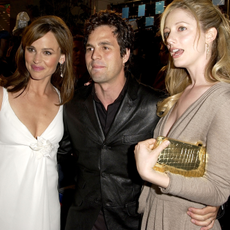 Jennifer Garner, Mark Ruffalo and Judy Greer Had the CUTEST '13 Going on 30' Reunion


 The Best Bollywood Movies of 2023 (So Far)
 ‘Bachelor in Paradise’ 2023: Everything We Know
 Who Is Gerry Turner, the ‘Golden Bachelor’?
 ‘Virgin River’ Season 6: Everything We Know
 The 60 Best Musical Movies of All Time
 'Ginny & Georgia' Season 2: Everything We Know
 35 Nude Movies With Porn-Level Nudity
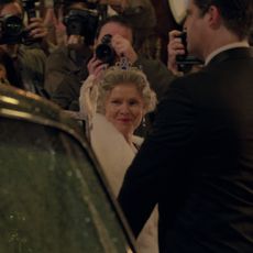 The Cast of 'The Crown' Season 5: Your Guide


