

On Wednesday morning, ride-sharing app Uber unveiled its new logo, courtesy of Adweek. The pared-down logo, which gets rid of the all-caps look in favor of a rounded, more approachable format, is just one part of what Adweek's Diana Pearl calls a "brand revamp." The company, according to the report, is aiming to put its troubled reputation—which has been marred by multiple controversies—behind it with the revamp.
Let's start with the logo. The first Uber logo was unapologetically brash, the word "UBER" written in square white capitals on a black background. It looked more like a road sign than an approachable brand. Later, the writing became black on white, but with the same format. With the new logo, Uber is seemingly trying to reframe itself as a more friendly brand—the "Uber" keeps only the capital "U", and is otherwise written in a curved, lowercase format. The typeface, according to Adweek, was custom-made for Uber, and has been named Uber Move.
The new "Uber" logo will also replace the old symbol that used to show up on the first page of your iPhone. It'll read simply "Uber," rather than showcasing the formerly harsh white circle against a dark background. (Formerly black, the background later became shades of green and black.)
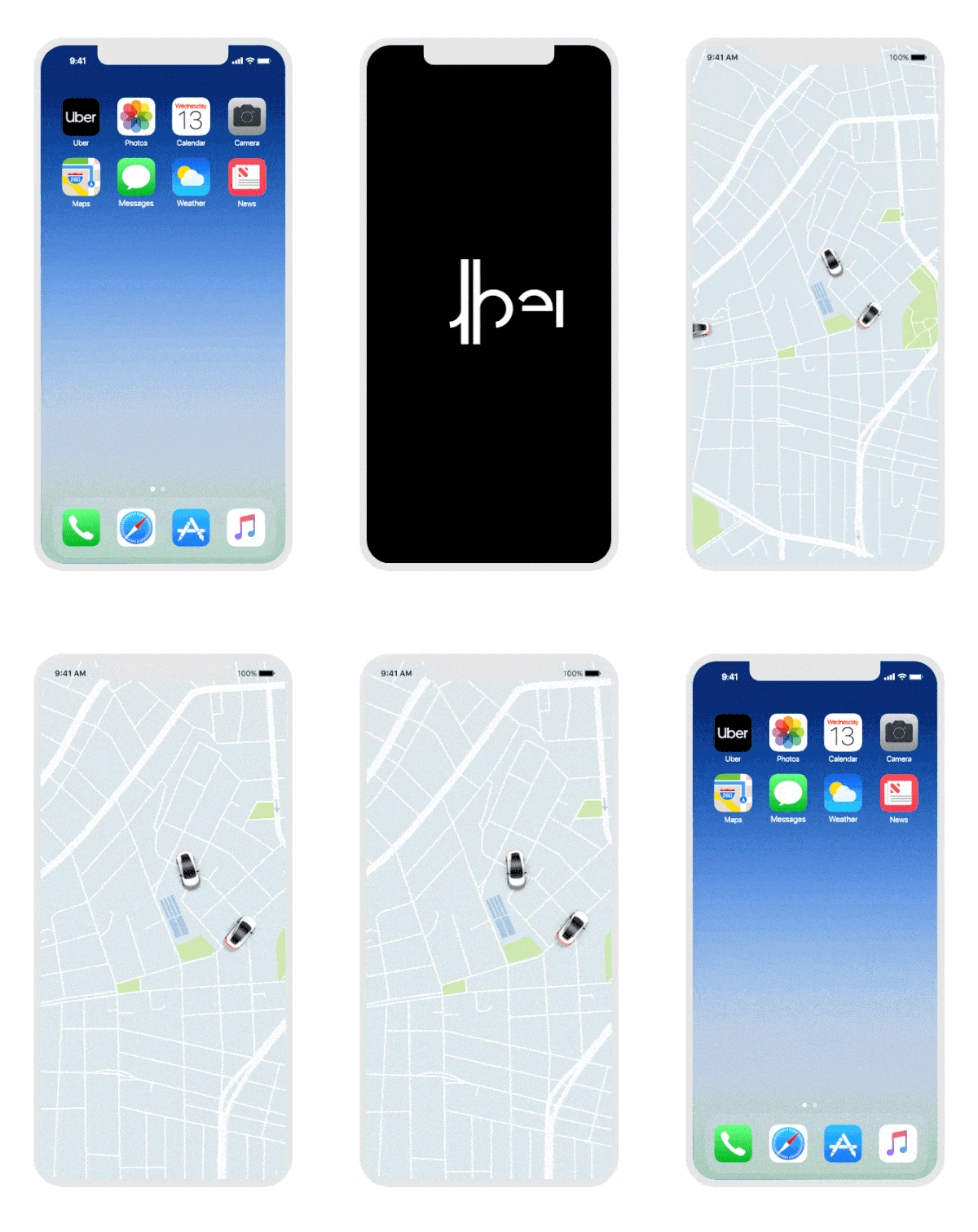
There's more. Inside the app itself, you'll find new animations and coloring, like a blue "safety" symbol that will represent "safe" spaces, like college lighting, according to Adweek's Pearl.
The primary colors will remain black and white, but "secondary" colors will also play a role—they'll "take inspiration from transportation," Adweek reports, e.g. shades of orange and brown.
Here's Uber's initial logo and corresponding symbol, for reference:

Here's what it was tweaked to, later:
Stay In The Know
Marie Claire email subscribers get intel on fashion and beauty trends, hot-off-the-press celebrity news, and more. Sign up here.

And here's the new one.

Twitter's response? Yeah, the old one was kind of weird, anyway.
Wow, big Uber rebrand this morning. Goodbye weird bits and atoms logo. https://t.co/gIs0ZPJr9kSeptember 12, 2018
RELATED STORIES



Jenny is the Digital Director at Marie Claire. Originally from London, she moved to New York in 2012 to attend the Columbia Graduate School of Journalism and never left. Prior to Marie Claire, she spent five years at Bustle building out its news and politics coverage. She loves, in order: her dog, goldfish crackers, and arguing about why umbrellas are fundamentally useless. Her first novel, EVERYONE WHO CAN FORGIVE ME IS DEAD, will be published by Minotaur Books on February 6, 2024.
-
 Prince William Single-Handedly Planned His and Kate Middleton’s Romantic Honeymoon
Kate had no idea where they were headed on their two week luxurious break from reality until after their 2011 wedding.
By Rachel Burchfield Published
-
 Bitten Lips Took Center Stage at Dior Fall 2024 Show
Models at the Dior Fall 2024 show paired bitten lips with bare skin, a beauty trend that will take precedence this season.
By Deena Campbell Published
-
 Princess Diana Revealed to a Royal Author the Real Reason Why Her Marriage to Prince Charles Ended Not Long Before She Died in 1997
And no, it apparently wasn’t Camilla Parker-Bowles.
By Rachel Burchfield Published
-
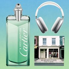 48 Last-Minute Father's Day Gifts to Scoop Up
He'll never even know you left it until now.
By Rachel Epstein Published
-
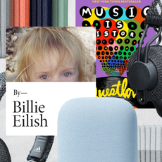 16 Gifts Any Music Lover Will Be Obsessed With
AirPods beanies? Say less.
By Rachel Epstein Published
-
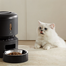 This Pet Food Dispenser Is a Game-Changer for My Pet
The futuristic-looking Petlibro Granary makes me feel so much less guilty being away from my dog.
By Cady Drell Published
-
 The Privacy Whisperers
You've read about their companies in the news. Now, hear from the women behind data privacy at the tech industry's heaviest hitters—Facebook, Apple, Google, and more.
By Colleen Leahey McKeegan Published
-
 My Data Is Safe, Right?
There are two parts to the online safety conversation: privacy and security. Our quiz will help determine whether you're good to go on both fronts.
By Rachel Tobac Published
-
 Who Are Myka & James Stauffer, Who Face Controversy After "Rehoming" Son Huxley?
YouTube star Myka Stauffer and her husband James are facing backlash for re-homing their young son, Huxley, who they adopted in 2017 and who has autism.
By Jenny Hollander Published
-
 What Is "Houseparty," the App People Are Obsessed With In Quarantine?
It's the opposite of social isolation...without leaving your couch.
By Jenny Hollander Published
-
 Group Video Chat Apps to Download While You're Social Distancing IRL
Who's up for a virtual game night?
By Jenny Hollander Published