Uber Has a New Logo to Go With Its Big Brand Revamp
Your app is going to look a little different.
On Wednesday morning, ride-sharing app Uber unveiled its new logo, courtesy of Adweek. The pared-down logo, which gets rid of the all-caps look in favor of a rounded, more approachable format, is just one part of what Adweek's Diana Pearl calls a "brand revamp." The company, according to the report, is aiming to put its troubled reputation—which has been marred by multiple controversies—behind it with the revamp.
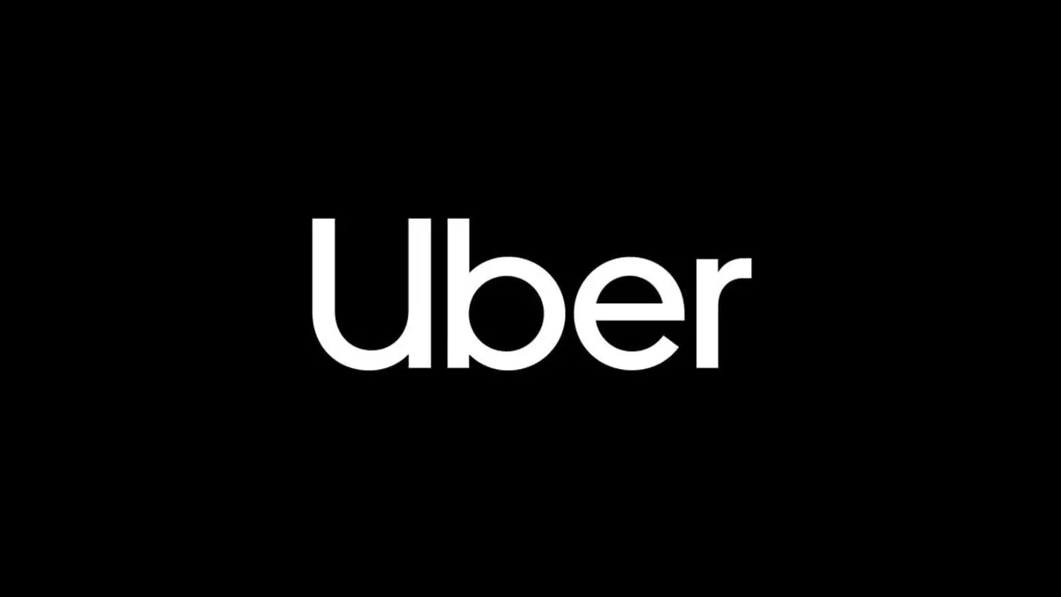
Let's start with the logo. The first Uber logo was unapologetically brash, the word "UBER" written in square white capitals on a black background. It looked more like a road sign than an approachable brand. Later, the writing became black on white, but with the same format. With the new logo, Uber is seemingly trying to reframe itself as a more friendly brand—the "Uber" keeps only the capital "U", and is otherwise written in a curved, lowercase format. The typeface, according to Adweek, was custom-made for Uber, and has been named Uber Move.
The new "Uber" logo will also replace the old symbol that used to show up on the first page of your iPhone. It'll read simply "Uber," rather than showcasing the formerly harsh white circle against a dark background. (Formerly black, the background later became shades of green and black.)


There's more. Inside the app itself, you'll find new animations and coloring, like a blue "safety" symbol that will represent "safe" spaces, like college lighting, according to Adweek's Pearl.
The primary colors will remain black and white, but "secondary" colors will also play a role—they'll "take inspiration from transportation," Adweek reports, e.g. shades of orange and brown.
Here's Uber's initial logo and corresponding symbol, for reference:

Here's what it was tweaked to, later:

And here's the new one.

Twitter's response? Yeah, the old one was kind of weird, anyway.
Wow, big Uber rebrand this morning. Goodbye weird bits and atoms logo. https://t.co/gIs0ZPJr9kSeptember 12, 2018
RELATED STORIES